FX % Change TableFX % Change Table
This tool provides currency strength analysis at a glance, allowing traders to instantly identify which currencies are outperforming or underperforming without the need to manually check each pair. It offers decision support for entries and exits by helping traders align their positions with broader strength and weakness trends, such as buying the strongest currency against the weakest. Its versatility makes it suitable for any timeframe, whether used by scalpers or swing traders. Best of all, it delivers these insights in a clean and simple format, presenting complex multi-pair calculations in an easy-to-read visual display.
This tool is especially helpful for traders who incorporate currency strength analysis, correlation checks, or basket trading into their strategy. It reduces time spent flipping through charts and provides a structured overview for smarter trade decisions.
Unlike traditional single-pair indicators, this tool calculates the percentage change between the current and previous higher timeframe closes for a group of forex pairs. You can choose between two curated groups:
• Majors – EURUSD, GBPUSD, USDJPY, USDCHF, AUDUSD, NZDUSD, USDCAD
• Cross Pairs – A wide basket of EUR, GBP, AUD, NZD, CAD, and CHF crosses
For each symbol, the script requests the selected timeframe’s price data, calculates the percentage change from the previous bar’s close, and then displays it in a neatly formatted table. Green highlights strength, red highlights weakness, and gray shows neutrality — making shifts in momentum instantly recognizable.
How to Use
1. Select your timeframe – For example, "60" (1H) to view hourly change, "240" (4H) for broader moves, or "D" for daily strength/weakness.
2. Choose your group – Focus on the Majors for a macro USD view, or switch to Cross Pairs for secondary flows.
3. Position the table – Place it in any corner of your chart (top-left, top-right, bottom-left, bottom-right) to match your workspace.
The table updates dynamically at the close of each bar, ensuring the displayed data always reflects the most recent market movements.
Pesquisar nos scripts por "Currency Strength"

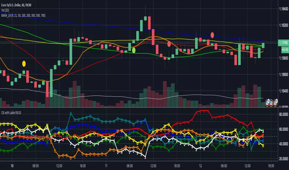
CSI - Currency strength indicator RSI 10This Indicator shows you the strength of the Currency in comparison for all other Main Currencys at the timeframe you choose.
The Currencys in this Indicator is: EUR, USD, GBP, CHF, AUD, CAD, JPY
The Base is the RSI (relative strength Indicator) with the following Currency pairs:
eurusd, eurgbp, euraud, eurjpy, eurcad, eurchf
usdeur, usdgbp, usdaud, usdjpy, usdcad, usdchf
gbpeur, gbpusd, gbpaud, gbpjpy, gbpcad, gbpchf
audeur, audusd, audgbp, audjpy, audcad, audchf
jpyeur, jpyusd, jpyaud, jpygbp, jpycad, jpychf
cadeur, cadusd, cadaud, cadgbp, cadjpy, cadchf
chfeur, chfusd, chfaud, chfgbp, chfjpy, chfcad
The letters in the LineChart:
EUR = E
USD = U
GBP = G
CHF = C
AUD = A
CAD = C
JPY = J
The CSI can help to see, if your trading pair have the potential to breakout on the support and resistance or if it more likely go back.
Some people say that the banks use this indicator.
NZD is missing there because Tradingview only support 6 variables.
If you have a solution for than, please let me know.
Thanks
Global MPMI OverviewThe Global MPMI Overview Indicator is designed to provide a comprehensive view of the Manufacturing Purchasing Managers' Index (PMI) for various countries and regions. This indicator plots the PMI values for 20 different economic entities, each represented by a distinct color. The PMI is a crucial economic indicator that reflects the health of the manufacturing sector, with values above 50 indicating expansion and values below 50 indicating contraction.
Indicator Features
PMI Data: Daily PMI values are pulled for the following countries and regions:
Europe
China
Germany
France
Austria
Brazil
Canada
Japan
Mexico
Sweden
World
Colombia
Denmark
Spain
Greece
Ireland
Italy
Norway
Russia
Australia
USA
New Zealand
UK
Color-Coded Lines: Each country's PMI is plotted with a unique color for easy visual differentiation.
Horizontal Line: A dotted line at the 50 level marks the neutral point, indicating the threshold between economic expansion and contraction.
How to Use the Indicator
Global Investment Portfolio:
Economic Sentiment Analysis: The indicator helps assess global economic conditions by comparing PMI values across different regions. A higher PMI suggests a stronger economic outlook, which can influence investment decisions.
Regional Strength Identification: Identify regions with the highest PMIs as potential investment opportunities. Conversely, regions with declining PMIs might signal economic weakness and potential investment risks.
Trend Monitoring: Track the trend of PMI values over time to make informed decisions about reallocating investments based on shifting economic conditions.
Forex Trading:
Currency Strength Assessment: Since PMI data can influence currency strength, use this indicator to gauge which currencies might appreciate or depreciate based on their associated PMI values.
Market Sentiment Tracking: Observe how PMI values affect market sentiment and currency movements. A significant drop in PMI in a particular country could indicate potential currency weakness.
Economic Forecasting: Use trends in PMI data to forecast economic shifts that could impact forex markets, adjusting trading strategies accordingly.
Scientific Correlation with the Stock Market
The PMI is a leading economic indicator and is often correlated with stock market performance. Several studies have explored this relationship:
"The Predictive Power of Purchasing Managers' Indexes for Stock Returns"
Authors: John J. McConnell and Chris J. Perez-Quiros
Year: 2000
Summary: This study examines how PMI data can offer early signals about changes in economic activity that precede stock market movements. The authors find that PMI data has predictive power for stock returns.
"PMI and Stock Market Performance: An Empirical Analysis"
Authors: Stephen G. Cecchetti and Kermit L. Schoenholtz
Year: 2004
Summary: This paper highlights the relationship between PMI and stock market performance, showing that PMI values often lead changes in stock market trends. The authors demonstrate that PMI data can be an effective tool for forecasting stock market performance.
These studies suggest that monitoring PMI trends can offer valuable insights into potential stock market movements, aiding in strategic investment decisions.
Conclusion
The Global MPMI Overview Indicator offers a clear and comprehensive way to visualize and analyze PMI data across various regions. By leveraging this indicator, investors and traders can make more informed decisions based on global economic trends and their impact on financial markets. Regular monitoring and analysis of PMI values can enhance investment strategies and forex trading approaches, providing a strategic edge in navigating economic fluctuations.

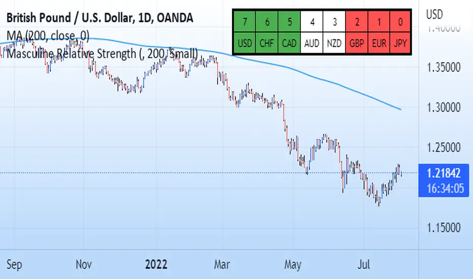
Masculine Relative StrengthThis relative strength indicator compares the G8 currencies against each other in all 28 combinations. It uses the 200 period moving average as a scoring system. For example on eurusd if current price action is above the MA that is +1 for the eur and -1 for the dollar and the inverse is applied if current price is under the 200 ma. The higher the number the stronger the currency. The weaker the number the weaker the currency. Pair the strongest currency with the weakest. This indicator does not guarentee profits and past performance does not guarentee the same future results.
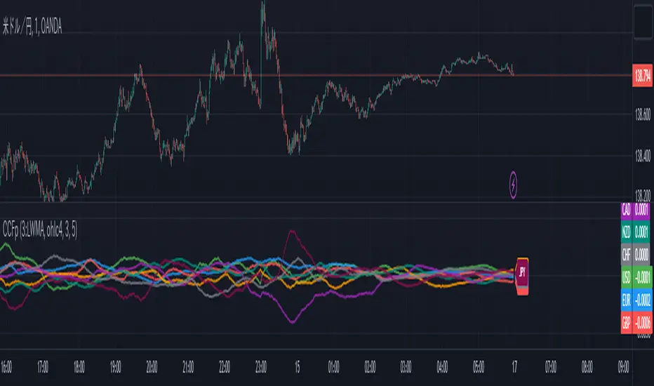
CCFp (Complex Common Frames percent) ,Currency StrengthCCFp displays the strength of a currency pair.
It is based on the CCFp of MT4.
It is available for USD, EUR, GBP, CHF, JPY, AUD, CAD, NZD.
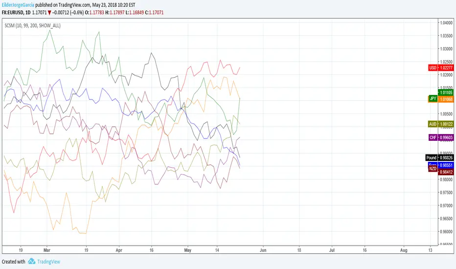
Simple Currency Strength MeasurerThis script is for measuring the strength of all currencies in the market, it's similar to indexes, but it's calculated differently and allows for customization to some degree.
For example, you can show the bar change of all currencies, or the SMA or EMA for customizable periods, or you can select one currency and check three SMAs or EMAs for comparison.
All currencies use 1 as the base, currencies over 1 are strong while the ones below one are weak.
If anyone knows the exact category where this script belongs, feel free to tell me, I think it belongs somewhere between volatility and trend analysis.
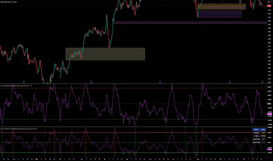
Relative Valuation OscillatorThis is a Relative Valuation Oscillator (RVO) this is attempt of replication OTC Valuation - a sophisticated multi-asset comparison indicator designed to measure whether the current asset is overvalued or undervalued relative to up to three reference assets.
Overview
The RVO compares the current chart's asset against reference assets (default: 30-Year Treasury Bonds, Gold, and US Dollar Index) to determine relative strength and valuation extremes. It outputs normalized oscillator values ranging from -100 (undervalued) to +100 (overvalued).
Key Features
Multiple Calculation Methods
The indicator offers 5 different calculation approaches:
Simple Ratio - Normalized ratio deviation from average
Percentage Difference - Percentage change comparison
Ratio Z-Score - Standard deviation-based comparison
Rate of Change Comparison - Momentum differential analysis (default)
Normalized Ratio - Min-max normalized ratio
Configurable Reference Assets
Asset 1: Default ZB (30-Year Treasury Bond Futures) - tracks interest rate sensitivity
Asset 2: Default GC (Gold Futures) - tracks safe-haven and inflation dynamics
Asset 3: Default DXY (US Dollar Index) - tracks currency strength
Each asset can be enabled/disabled independently
Fully customizable symbols
Visual Components
Multiple oscillator lines - One for each active reference asset (color-coded)
Average line - Combined signal from all active assets
Overbought/Oversold zones - Configurable threshold levels (default: ±80)
Zero line - Neutral valuation reference
Background coloring - Visual zones for extreme conditions
Signal line - Optional smoothed average
Entry markers - Long/short signals at key reversals
Signal Generation
Crossover alerts - When crossing overbought/oversold levels
Entry signals - Reversals from extreme zones
Divergence detection - Bullish/bearish divergences between price and oscillator
Zero-line crosses - Trend strength changes
Customization Options
Lookback period (10-500): Controls statistical calculation window
Normalization period (50-1000): Determines scaling sensitivity
Smoothing toggle: Optional EMA/SMA smoothing with adjustable period
Visual customization: Colors, levels, and display options
Information Table
Real-time dashboard showing:
Average oscillator value
Current status (Overvalued/Undervalued/Neutral)
Current asset price
Individual values for each active reference asset
Use Cases
Mean reversion trading - Identify extreme relative valuations for reversal trades
Sector rotation - Compare assets within similar categories
Hedging strategies - Understand correlation dynamics
Multi-asset analysis - Simultaneously compare against bonds, commodities, and currencies
Divergence trading - Spot price/oscillator divergences
Trading Strategy Applications
Long signals: When oscillator crosses above oversold level (asset recovering from undervaluation)
Short signals: When oscillator crosses below overbought level (asset declining from overvaluation)
Confirmation: Use multiple reference assets for stronger signals
Risk management: Avoid trading when all assets show neutral readings
This indicator is particularly useful for traders who want to incorporate inter-market analysis and relative strength concepts into their trading decisions, especially in OTC (Over-The-Counter) and futures markets.
CAD CHF JPY (Index) vs USDDescription:
Analyze the combined performance of CAD, CHF, and JPY against the USD with this customized Forex currency index. This tool enables traders to gain a broader perspective of how these three currencies behave relative to the US Dollar by aggregating their movements into a single index. It’s a versatile tool designed for traders seeking actionable insights and trend identification.
Core Features:
Flexible Display Options:
Choose between Line Mode for a simplified view of the index trend or Candlestick Mode for detailed analysis of price action.
Custom Weight Adjustments:
Fine-tune the weight of each currency pair (USD/CAD, USD/CHF, USD/JPY) to better reflect your trading priorities or market expectations.
Moving Average Integration:
Add a moving average to smooth the data and identify trends more effectively. Choose your preferred type: SMA, EMA, WMA, or VWMA, and configure the number of periods to suit your strategy.
Streamlined Calculation:
The index aggregates data from USD/CAD, USD/CHF, and USD/JPY using a weighted average of their OHLC (Open, High, Low, Close) values, ensuring accuracy and adaptability to different market conditions.
Practical Applications:
Trend Identification:
Use the Line Mode with a moving average to confirm whether CAD, CHF, and JPY collectively show strength or weakness against the USD. A rising trendline signals currency strength, while a declining line suggests USD dominance.
Weight-Based Analysis:
If CAD is expected to lead, adjust its weight higher relative to CHF and JPY to emphasize its influence in the index. This customization makes the indicator adaptable to your market outlook.
Actionable Insights:
Identify key reversal points or breakout opportunities by analyzing the interaction of the index with its moving average. Combined with other technical tools, this indicator becomes a robust addition to any trader’s toolkit.
Additional Notes:
This indicator is a valuable resource for comparing the collective behavior of CAD, CHF, and JPY against the USD. Pair it with additional oscillators or divergence tools for a comprehensive market overview.
Perfect for both intraday analysis and swing trading strategies. Combine it with EUR GPB AUD (Index) indicator.
Good Profits!

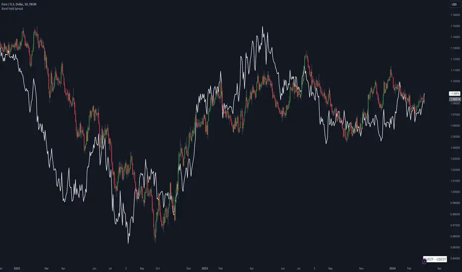
Bond Yield SpreadThe Bond Yield Spread Script is developed for forex traders, offering an automated tool to calculate the bond yield spread between two countries associated with the forex pair displayed on the chart.
Functionality:
The script starts by identifying the base and quote currencies of the current forex pair and aligns them with their corresponding national bond symbols based on user-selected maturity, with options ranging from 01Y to 30Y. It calculates the yield spread by subtracting the bond yield associated with the quote country from that of the base country, following the formula:
Yield Spread = Yield(Base Country) − Yield(Quote Country)
which is then displayed as a plot line on the chart.
This script relies solely on TradingView's internal yield symbols, with the following calculation:
"currency" => "first two letters" + maturity
And maturity, in this case, is the value that is configured in the indicator settings, for example:
"EUR" => "EU" + "02Y" will result in EU02Y -> which will be used in the formula, depending on the quote or base currency.
Application in Trading:
This indicator is invaluable for traders employing carry trading strategies or assessing currency strength based on traded interest rates as an indicator. A higher yield spread typically indicates a stronger currency, because the return obtained for holding the currency is higher.
Originality and Practicality:
This script is self-developed, aiming to fill the gap in automatic bond yield comparisons within the TradingView environment. It is particularly beneficial for traders focusing on macroeconomic factors affecting forex markets. Unlike other scripts, it integrates various bond maturities into one tool, enhancing its utility and application range.
Conclusion:
Designed for traders incorporating macroeconomics in their strategy, this script will be useful to calculate the bond yield differences automatically without having to enter a new formula for every new currency pair.
Compliance and Limitations:
The script complies with TradingView scripting standards, ensuring no lookahead bias and maintaining real-time data integrity. However, its utility depends on the comprehensive availability of bond yield data within TradingView. As not all countries issue bonds for each listed maturity, this may limit the script’s application for certain currency pairs or specific maturities.
Fed Balance Sheet (Candles)Fed Balance Sheet (Candles) - TradingView Description
📊 OVERVIEW
Fed Balance Sheet (Candles) transforms the Federal Reserve's total assets into an intuitive candlestick visualization, allowing you to track monetary policy changes with the same visual language you use for price action.
This indicator pulls real-time data directly from FRED (Federal Reserve Economic Data) and displays the Total Assets of All Federal Reserve Banks as dynamic candles on your chart, making it effortless to correlate central bank liquidity with market movements.
🎯 WHY THIS MATTERS
The Federal Reserve's balance sheet is one of the most powerful leading indicators in global markets. When the Fed expands its balance sheet (Quantitative Easing), it injects liquidity into the financial system, historically correlating with:
Rising asset prices (stocks, crypto, commodities)
Lower volatility
Risk-on sentiment
Currency devaluation
When the Fed contracts its balance sheet (Quantitative Tightening), liquidity drains from markets, often leading to:
Asset price pressure
Increased volatility
Risk-off sentiment
Dollar strength
By visualizing this as candles, you can instantly see:
The pace of change (candle size)
The direction (green = expansion, red = contraction)
Acceleration or deceleration (consecutive candles in same direction)
Pivots in monetary policy (color changes from green to red or vice versa)
🔧 HOW IT WORKS
Data Source
Source: Federal Reserve Economic Data (FRED)
Metric: Total Assets of All Federal Reserve Banks
Unit: Displayed in Trillions of USD for easy reading
Frequency: Weekly updates (every Wednesday)
Candlestick Construction
Since balance sheet data is reported as a single number each week (not traditional open-high-low-close), this indicator creates candles by comparing each period to the previous one:
Open = Last week's balance sheet value
Close = This week's balance sheet value
High = The higher of the two values
Low = The lower of the two values
This captures directional movement and magnitude of change, making it intuitive for traders accustomed to candlestick analysis.
Color Scheme
🟢 GREEN CANDLES (Expanding Balance Sheet)
When this week's value is higher than last week's
Interpretation: Fed is adding liquidity (Quantitative Easing)
Historically bullish for risk assets
🔴 RED CANDLES (Contracting Balance Sheet)
When this week's value is lower than last week's
Interpretation: Fed is removing liquidity (Quantitative Tightening)
Historically bearish or neutral for risk assets
Value Label
A floating label displays the current balance sheet value in trillions (e.g., "$8.75T") so you always know the exact figure at a glance.
📈 PRACTICAL APPLICATIONS
1. Market Regime Identification
Strings of green candles = Liquidity-driven bull markets
Strings of red candles = Tightening-induced bear markets or corrections
Color transitions = Potential market inflection points
2. Correlation Analysis
Overlay on stock indices (SPY, QQQ, IWM)
Overlay on crypto (BTC, ETH)
Overlay on commodities (Gold, Silver)
Observe how asset prices react to Fed liquidity changes in real-time
3. Macro Timing
Large green candles = Aggressive easing (crisis response)
Large red candles = Aggressive tightening (inflation fighting)
Small candles = Neutral policy (Fed on hold)
4. Risk Management
Shift portfolio allocation based on liquidity environment
Reduce leverage during red candle trends
Increase exposure during green candle trends
Use as confirmation for other technical signals
5. Multi-Timeframe Context
Daily charts: See how daily price action relates to weekly Fed data
Weekly charts: Perfect alignment with data release frequency
Monthly charts: Visualize long-term monetary cycles spanning years
⚙️ SETTINGS
Zero configuration needed. Simply add the indicator to any chart and it works immediately.
The indicator automatically:
Overlays on your main chart
Uses the left price scale (won't interfere with asset prices)
Updates with the latest Fed data
Displays values in trillions for clean readability
🎨 VISUAL DESIGN PHILOSOPHY
The indicator uses semi-transparent candle bodies with vibrant borders to maintain visibility without obscuring your price action. The color scheme follows universal chart conventions where green represents growth/expansion and red represents decline/contraction.
It's designed to blend seamlessly into any chart theme while providing immediate visual clarity about the Fed's monetary stance.
📚 WHAT YOU NEED TO KNOW
Data Availability
Historical data available from December 2002 (over 20 years of Fed policy)
Updates every Wednesday (Federal Reserve's reporting schedule)
Typically published with a 1-week lag
How the Data Appears
On weekdays: Shows the most recent Wednesday's data
On weekends: Shows Friday's data (which is the prior Wednesday's figure)
Updates automatically when new data is released
Scale Considerations
The Fed's balance sheet is measured in trillions, while most assets are priced much lower. The indicator uses the left price scale by default to avoid conflicts with your main asset's price scale. You can easily move it to a separate pane if you prefer.
🧠 INTERPRETATION GUIDE
Historical QE Phases (Green Candles)
2008-2014: Financial Crisis Response
The Fed's balance sheet expanded from under $1T to ~$4.5T to stabilize markets after the mortgage crisis.
2020: COVID-19 Response
Rapid expansion to ~$7T as the Fed stepped in during pandemic lockdowns.
2020-2022: Extended Support
Balance sheet reached historic peak of ~$9T.
Historical QT Phases (Red Candles)
2017-2019: First Modern QT Attempt
The Fed tried to normalize its balance sheet, reducing it from ~$4.5T to ~$3.8T before pivoting.
2022-Present: Inflation-Fighting QT
The Fed began shrinking its balance sheet to combat inflation, letting bonds mature without replacement.
Key Insights
Size matters, but rate of change matters MORE.
A $9T balance sheet growing slowly has different implications than a $5T balance sheet growing rapidly.
Watch for acceleration.
Increasingly large candles (up or down) signal a policy shift that markets will notice.
Plateaus mean "wait and see."
Tiny candles indicate the Fed is holding steady and watching economic data.
Reversals are major events.
When candles switch from green to red (or vice versa), the Fed has changed course—these are critical market turning points.
🎓 EDUCATIONAL VALUE
This indicator helps you understand:
The mechanics of monetary policy through visual learning
The lag between Fed actions and market reactions by observing temporal correlation
The scale of modern central banking (trillions put into perspective)
The relationship between liquidity and asset prices (cause and effect in action)
Many traders talk about "don't fight the Fed" but never actually track what the Fed is doing. Now you can see it as clearly as you see price action.
🔗 RELATED CONCEPTS
For comprehensive macro analysis, consider also tracking:
Fed Funds Rate (short-term interest rates)
M2 Money Supply (broader measure of money in circulation)
Treasury Yield Curves (bond market expectations)
Dollar Index (DXY) (currency strength)
VIX (market fear/volatility)
The Fed's balance sheet is just one piece of the puzzle, but it's arguably the most important one for understanding liquidity conditions.
⚠️ DISCLAIMER
This indicator displays publicly available economic data from the Federal Reserve. It is for informational and educational purposes only and does not constitute financial advice.
Important considerations:
Past monetary policy does not guarantee future market outcomes
Correlation does not equal causation
Asset prices are influenced by many factors beyond Fed liquidity
Always use proper risk management
Consult with qualified financial professionals before making investment decisions
Trading involves substantial risk of loss and is not suitable for everyone.
📜 VERSION HISTORY
Version 1.0 - Initial Release
Fed balance sheet visualized as candlesticks
Real-time FRED data integration
Automatic display in trillions
Dynamic color coding (green/red)
Current value label with exact figure
💡 WHY CANDLES?
You might wonder: "Why show the Fed's balance sheet as candles instead of a line?"
Because candles tell stories that lines can't.
A line shows you where we are
Candles show you how we got here, how fast we're moving, and what momentum looks like
Candles make the Fed's actions feel immediate and tangible
Candles connect macro data to the chart language you already speak
When you see three big green candles in a row on the Fed balance sheet while your crypto or stock portfolio is rallying, you feel the connection. When you see the candles turn red and shrink, you understand the headwinds forming.
It transforms dry economic data into actionable market intelligence.
📞 SUPPORT & FEEDBACK
If you find this indicator valuable:
⭐ Like and favorite to help others discover it
📝 Comment with your use cases and insights
🔔 Follow for updates and new macro indicators
Your feedback drives improvements and helps build better tools for the trading community.
🚀 THE BOTTOM LINE
The Fed's balance sheet is the tide that lifts or lowers all boats.
Whether you're trading stocks, crypto, forex, or commodities—whether you're a day trader or long-term investor—understanding the Fed's liquidity operations gives you an edge.
This indicator makes that understanding visual, immediate, and actionable.
Stop guessing about macro conditions. Start seeing them.
"Don't fight the Fed" - Wall Street Wisdom
Now you can see exactly what they're doing—in the same language you use to read price action.
May your trades ride the tide of liquidity. 🌊📈

Advanced Currency StrengthThis indicator shows the strength of currency based on its movement. Ossiclator.

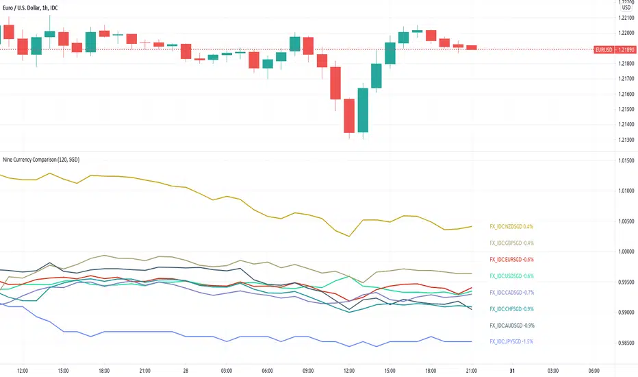
[JL] Nine Currency ComparisonI usually only trade major and minor pairs.
But just got an idea to show all 8 currencies based on SGD on one chart.
So I made this script - another currency strength index.
Tradingview does not have SGDCAD, so based on SGD we can only watch other currencies vs SGD.
But for other currencies, the chart display the curency vs others.
Global Macro Scanner & Relative PerformanceDescription: This indicator is an all-in-one Macro Dashboard that allows traders to track money flow across major global asset classes in real-time. It combines a floating data table with a normalized percentage-performance chart.
Features:
Macro Dashboard (Table): Displays the current value, daily % change, and status (Inflow/Outflow) for 9 key economic sectors:
US M2 Supply: Tracks monetary inflation/tightening.
DXY (US Dollar): Currency strength.
Bonds (AGG): US Aggregate Bond market.
Stocks (VT): Total World Stock Index.
Real Estate (VNQ): Vanguard Real Estate ETF.
Commodities: Oil (WTI), Gold, and Silver.
Crypto: Total Crypto Market Cap.
Relative Performance Chart (Lines): Instead of plotting raw prices (which have vastly different scales), this script plots the Percentage Return relative to a baseline.
Lookback Period: You can set a lookback (default 100 bars). The script sets the price 100 bars ago as "0%" and plots how much each asset has gained or lost since then.
Comparison: This allows you to visually see which assets are outperforming or underperforming relative to each other over the same time period.
Visual Aids:
Dynamic Labels: Each line is tagged with a label at the current candle so you can identify assets without needing a legend.
Colors: Each asset has a distinct, fixed color for consistency between the table and the chart.
How to use:
Add the script to your chart.
Adjust the "Lookback" setting in the inputs to change the starting point of the comparison (e.g., set it to the start of the year to see Year-to-Date performance).
Use the dashboard to spot daily money flow rotation (e.g., Money moving out of Stocks and into Gold).

Risk On/Risk Off by Gary# Risk On/Risk Off Indicator (RORO)
## Overview
The Risk On/Risk Off (RORO) Indicator is a comprehensive market sentiment gauge that measures the balance between risk-seeking and risk-averse behavior across multiple asset classes. This indicator helps traders identify shifts in market sentiment and potential trend changes.
## How It Works
The RORO indicator aggregates normalized price movements (Z-scores) from eight major asset classes:
**Risk-On Assets (Bullish Sentiment):**
- Bitcoin Futures (BTC1!) - Cryptocurrency risk appetite
- WTI Crude Oil Futures (CL1!) - Energy sector strength
- AUD/JPY Exchange Rate - Carry trade indicator
- Emerging Markets ETF (EEM) - Global growth proxy
**Risk-Off Assets (Defensive Sentiment):**
- Gold Futures (GC1!) - Safe haven demand
- 10-Year Treasury Bonds (ZN1!) - Flight to quality
- US Dollar Index (DXY) - Reserve currency strength
- VIX Index - Market fear gauge (inverted)
## Key Features
- **Z-Score Normalization**: Standardizes different asset classes for fair comparison
- **Customizable Weights**: Adjust the influence of each asset class
- **Dynamic Coloring**: Green indicates rising risk appetite, red shows declining risk appetite
## Interpretation
- **Rising RORO (Green)**: Increasing risk appetite - favorable for equities, commodities, and growth assets
- **Falling RORO (Red)**: Decreasing risk appetite - rotation into safe havens
- **Divergences**: When RORO and price move in opposite directions, potential reversal signal
## Use Cases
1. **Market Regime Identification**: Determine current risk environment
2. **Divergence Trading**: Spot when price action contradicts underlying sentiment
3. **Portfolio Management**: Time defensive vs. aggressive positioning
4. **Confirmation Tool**: Validate breakouts and trend changes
## Settings
- **Lookback Period**: Controls Z-score calculation sensitivity (default: 50)
- **Asset Weights**: Fine-tune the contribution of each asset class
- **Color Scheme**: Customize rising/falling colors
## Best Practices
- Use on daily or higher timeframes for most reliable signals
- Combine with price action and volume analysis
- Watch for sustained moves rather than single-bar changes
---
*This indicator is designed for educational purposes. Always conduct your own analysis and risk management.*

Global Money Flow IndexThis indicator base on "Currency Strength Indicator C SA 5-Step Scalp" - Indmoney. I remake it, add CHF, convert to version 5. I use MFI not RSI .
This indicator will show you money flow of all currency in market base on MFI . (the origin version he use RSI ) and you can change period of MFI to fit with your trading style.
Goodluck and happy trading!

Trend Trading with Currency Strength MeterThis is a trend trading strategy designed mainly for forex made of two big components:
First we have the currency meter, which is made of taking TSI of different INDEXes such as EUR, USD, GBP, JPY, NZD, AUD , CHF and CAD.
Once we establish which one is the weakest and most powerful, we pair them together and we go on that chart.
Lastly we check with the EMA 200 to confirm our direction.
We can see in this example for the USDJPY chart, that USD is the strongest, JPY is the weakest and ema confirm our bullish trend.
For timeframe in general I recommend big timeframes, 1-4h+ , and as a mentality a swing trading mentality, we can stay in trade for days/weeks.
For exit in general I recommend to exit when either one of the pairs losses/gain power or when the EMA is crossing with current candle
If you have any questions, let me know !


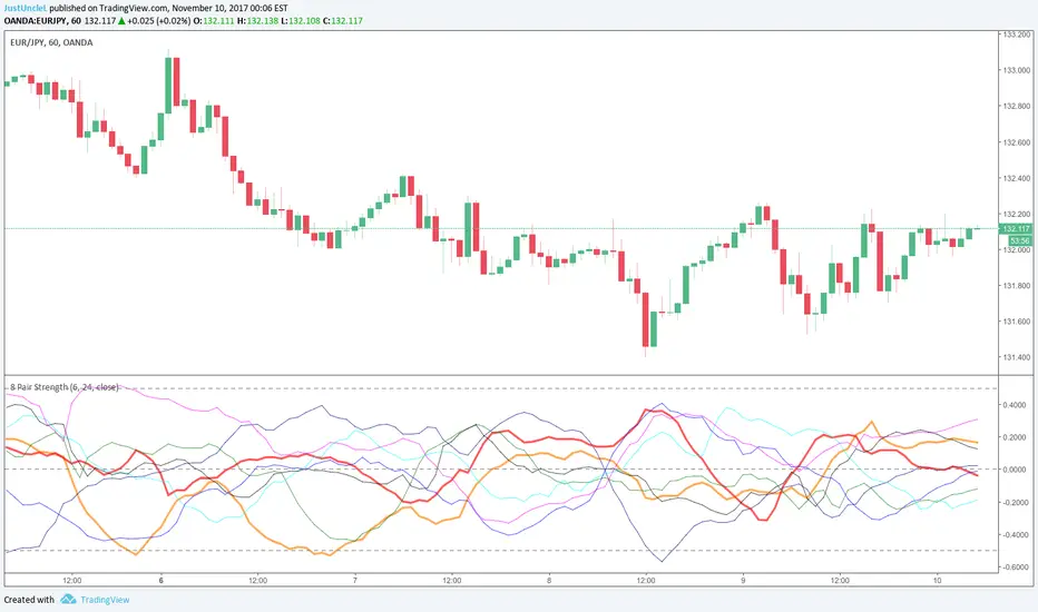
8 Pair Strength R2.0 updated by JustUncleLThis is an updated script Originally written by @glaz
Description:
This study is a version of Currency Strength Meter, that utilises TradingView's built-in "True Strength Index" (TSI) function. The TSI uses moving averages of the underlying momentum of a financial instrument.
Modifications:
10-Nov-2017 by JustUncleL
Corrected the weighting on JPY pairs, by dividing their close values by 100 to bring them within 1.0 range of the other pairs.
Added option to use different Data Source, eg hl2, hlc3, ohlc4 etc.
Updated to PineScript version 3.
Updated variable names to reflect their origin.

Z Score FilterComposite Risk Filter
This indicator works because it aggregates several independent but structurally important stress channels (currency strength, rates, equity volatility, bond volatility, and credit conditions) into a single normalized measure. Each input is transformed into a z-score, meaning the composite does not care about absolute levels, narratives, or regimes; it only measures whether conditions are tightening or easing relative to what has been normal recently. That makes the output robust to inflation, secular trends, and structural shifts that break simpler correlations.
What the indicator captures is not direction but constraint. Markets do not move because risk is “on” or “off”; they move because certain behaviors are more or less permitted under prevailing financial conditions. By identifying when systemic pressure is elevated, relaxed, or neutral, the indicator helps align trade expectations with the environment price is operating in. When used as a filter — not a signal — it reduces false confidence, improves expectancy selection, and keeps price in the primary role where it belongs.

Trading ScorecardChecklist, note, scorecard, custom table. I originally created the table for currency strength analysis, but it can be used as a checklist. You can also create your own scoring system. The number of columns and rows can be changed. The color and size of the table are customizable.

Simple Currency Strength Measurer IVVersion IV of the SCSM, this time thanks to @SAACI I learned more about the financial markets and some math stuff. This time I switched the formula a bit to use Zscores:
(close-sma(close,shortma))/stdev(close,dev)
This creates a nice oscillator like view, if you overlay TWO of them, one longer and one shorter you can get almost perfect absolute highs and absolute lows. Enjoy.
